
The color looked as if it was pulled from a Christmas tree ornament, the deepest shade of candy apple red you’ve ever seen. It simply glowed beneath the parking lot lights, perfectly complementing the Miata’s lines.
So, of course, I had to ask the owners: Was the paint custom or someth…
Read the rest of the story
OK, since you seem to be stuck in the 70s I'll try my best to keep you happy. Current plan for my '72 Corolla Challenge car ( if I ever get the darned thing finished) is "tool box" red ($10/gallon), white meatballs on the hood, trunk, and doors with black numbers. Since the car has a black fiberglass power bulge hood anyway, that will likely be flat black. Wide silver wheels, covered by some sort of 5" wide flares to complete the look. Maybe some white stripes along the lines of the Boss 302 Trans-Am Mustangs. I expect pictures in the magazine since you seem to have some pull around there.
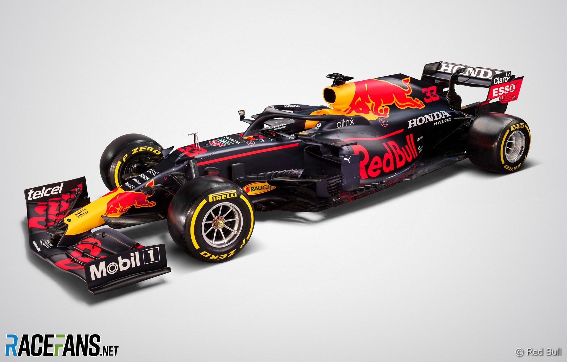
It is 100% the fault of wraps. It's so easy to drape a complex design over a car that that's all the designers do. Red Bull in particular is a frequent offender. Come up with something that looks good in a render and forget that it will fail to pop at speed.
Also - it's harder to do a graphically strong simple livery than a complex one from a design standpoint, and that's especically true with modern tools and wraps. With paint, it's the exact opposite - the medium rewards simplicity, which means you lean towards big bold statements in distinct colors.
People are invariably surprised when they find out the stripes on my car are paint.
Ironically, the first time I put numbers on a race car it was on a standardized panel that had GRASSROOTS MOTORSPORTS printed along the top :)
In reply to Keith Tanner :
You weren't the only one with a GRM panel on a Miata (circa 2006).....
In reply to Keith Tanner :
Red Bull just needs to de-clutter their designs a bit. Like so................


Duke
MegaDork
1/3/22 11:14 a.m.
In reply to David S. Wallens :
THANK YOU. I hate the overly complex "dazzle camo" schemes that became popular in the early-Oughties. They complete eradicate the lines of the car and, worse, they usually distract from the very point of brand identification.

j_tso
HalfDork
1/3/22 11:32 a.m.
I'm sure they were simple back then because the car would otherwise spend too much time in the paint shop. Tape and spray some stripes quickly so the team can get back to testing.
Red Bull's livery may be complex, but the cartoon bull on the side makes their cars easy to spot.
In reply to j_tso :
Also, back in the old days, ads on race cars started out as a way for teams to recoup some costs (John Player Lotus). Now racing is almost completely subsidized by advertising above the club level, and even to some extent at the club level. Race cars are just another advertisement, and Red Bull wants to be 1000% sure whoever is flipping through the channels past a race sees their logo.
DeadSkunk (Warren) said:
In reply to Keith Tanner :
Red Bull just needs to de-clutter their designs a bit. Like so................
Ironically, they have really solid design on their cans. I know that they're probably totally different entities by this point, but still - some graphic consistency would help both brands.
Red Bull race car. A visual mess, the only thing that really stands out in action photos or on TV is the yellow splotches.
Red bull can and box.

At least one vehicle designer figured it out :)

j_tso said:
I'm sure they were simple back then because the car would otherwise spend too much time in the paint shop. Tape and spray some stripes quickly so the team can get back to testing.
Red Bull's livery may be complex, but the cartoon bull on the side makes their cars easy to spot.
Exactly. The constraints of paint time forced the designers to come up with designs using strong, simple graphical elements. Remove those constraints and the designers forget some of the fundamentals.
Red for Ferrari Green for Jaguar, white for America.
No sponsor needed. Those Cigarette, beer, & booze companies spent their money on Magazines and Radio. That new Television? Eh, just a fad.
In reply to frenchyd :
Red for Italy, green for the UK, white for Germany, blue for France, white with blue stripes for the US.
In reply to Keith Tanner :
I thought Germany was silver.

Rons
HalfDork
1/3/22 12:43 p.m.
Floating Doc (Forum Supporter) said:
In reply to Keith Tanner :
I thought Germany was silver.
You’re both correct
https://en.m.wikipedia.org/wiki/List_of_international_auto_racing_colours
I think besides wraps, the other thing being forgotten here is the impact of TV and print. In the old pre digitals days of of cathoderay TV's, you would never have been able to see a modern complicated livery. Most modern schemes would have just looked like a blur on an old TV. Liveries had to be simple and bold so you could actually see them on TV. Similar with the print media, while people could take amazing film pics, the resolution which they could be reproduced in print media (more talking the weekly magazines rather than glossy books here) had the same issue. A modern car would look a mess. It's not that wraps have ruined liveries, it's that changes in TV and advertising has allowed us to make use of what wraps can do.
Rons said:
Floating Doc (Forum Supporter) said:
In reply to Keith Tanner :
I thought Germany was silver.
You’re both correct
https://en.m.wikipedia.org/wiki/List_of_international_auto_racing_colours
I was going all the way back for Frenchy :) I enjoy that story about Germany basically changing its national racing color for efficiency.
Computers happened. More specifically, computer software that allowed relatively easy production of complex designs to be achieved and produced. Obviously there still needs to be a creative person involved to actually dream up the design.
Duke
MegaDork
1/3/22 1:31 p.m.
Adrian_Thompson (Forum Supporter) said:
A modern car would look a mess. It's not that wraps have ruined liveries, it's that changes in TV and advertising has allowed us to make use of what wraps can do.
Except that many modern race cars do look a mess, regardless of how well that mess is reproduced on TV and in magazines.
It is not computers or the designers, its corporate branding by committee that throws the designers work out the window and nobody cares because it will change in a race or two who is the sponsor except the main.
I love what they can do with wraps now and I cannot imagine painting a car with sponsors that change to a quality that I would find acceptable. I did it with the 550 spyder and if I had to do it again I would do it with printed waterslide decals and even then I would think wrap first. Also I still think camo wraps are kind of cool in that hide the wind tunnel detail way they were used.
Duke said:
Adrian_Thompson (Forum Supporter) said:
A modern car would look a mess. It's not that wraps have ruined liveries, it's that changes in TV and advertising has allowed us to make use of what wraps can do.
Except that many modern race cars do look a mess, regardless of how well that mess is reproduced on TV and in magazines.
Agreed, but I put that down to now being an official old fart and out of touch!
They need to ask: What would John Player Special do?

In reply to wearymicrobe :
That's part of the problem, too. But it would be a lot more work, and sometimes impossible, to achieve the looks and the rapid turnaround without the benefits of technology.
I'm not much of a graphic designer, but I came up with something pretty simple that I really like. A black 190E sedan is about as boxy and boring as you can get for a race car. I wanted something that would stand out a bit. Came up with the checkered flag plus color-matched wheels idea: first in GT3 orange, then in baby blue.


I enjoy the simple designs too. Sometimes it's hard to even tell who's sponsoring a car or if that's even the point of the livery.

Simple, sexy, loud

SSpiffy
New Reader
3/1/22 4:52 p.m.
As a flagger, what I want to see is something in a large, simple font, with a wide stroke, and good contrast with the background color. If I can't read it as you go by 100 feet away at speed, it does me no good.
When I was racing, I had a 9" high (the largest that would fit the sidepod of my F500) white number in Helvitica with a 2" stroke on a dark blue background. Meatballs are the best way to do this, but not necessary.


