We're still gapping the plugs and setting ignition timing. In the mean time, if you visit the forum via classicmotorsports.net, it should work better.
We're still gapping the plugs and setting ignition timing. In the mean time, if you visit the forum via classicmotorsports.net, it should work better.
The forum was down last nigh and this morning. To whom do I write a strongly worded letter?
HOLY E36 M3! LOOK AT THAT PREVIEW! THAT'S AWESOME!
With commercially-available near-universal solutions, I still fail to understand why certain places persist on having custom forum setups.
When you fix the links to the sister forums, please include all forums, not just a select few. The V-bulletin drop down works great.
Also, the search here has never really been usable. Functional search means fewer threads on repeated topics, more information available to new users (to grow the community) and less effort on the part of the regular users.
I miss the forum links at the bottom of the page because it made it quick to scan the page and go to the next forum. I am on the mobile version.
Sultan wrote: I miss the forum links at the bottom of the page because it made it quick to scan the page and go to the next forum. I am on the mobile version.
That's the only thing I miss is the links to the other forums at the bottom. Now I have to go all the way back up to the main board and navigate. I know, first world problems, but you did as for suggestions...
Other than that, I like the new site. The increase in white space makes it seem cleaner and easier to read.
-Rob
Dang, I was really hoping for a new search engine. I use google site search and it usually works pretty well, but it sure would be nice to be able to search by author.
Site layout looks really nice though beside that and the left hand 1/3 blank page issue that's been noted.
Working well in Safari on my current IOS, iPhone 5S.
Once we get our shortcut buttons back on each page for Latest, My Posts, etc. we'll be set.
still slow on Safari ..
what I miss is the indication to the left of the threads that tell me if there is something new posted to that thread
Yeah, lots of red, I'm not a fan of that, and I'd like to have the shortcut buttons back. But other than that, it feels cleaner.
Since you know you won't make everyone happy, let me say, great work and I appreciate the effort you put into making our little diversionary world more better.
First problem: When i copy something from a post to quote in my reply, it adds that stupid "to read more visit GRM blah blah" that i then have to delete when i paste it into a quote. That is SUPER annoying. Can you fix that?
Hopefully the site's working fast enough now (it is on our end). Thanks for your feedback. We're working on some of these other changes you've mentioned, like the red post preview text and the copy/paste add-on.
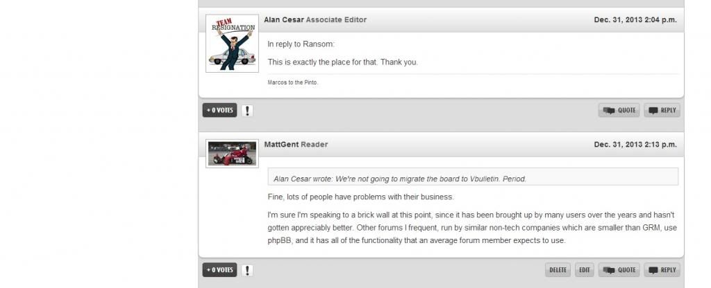
We're not going to migrate the board to Vbulletin. Period.
Yes, it's running much better now. Seems likes it's even faster than the old board.
More speed is always a good thing.
I think it's nice. There are things I question, but on the whole I think it's pretty damn good.
Alan, you'll get a bit of a speed boost by getting the JS files under control. I don't think that was the slowdown, but I did notice they're out of hand.
And I agree with you. Every time I hear someone say "What about Vbulletin" I hear "I know nothing about forum software."
Sultan wrote: I miss the forum links at the bottom of the page because it made it quick to scan the page and go to the next forum. I am on the mobile version.
I also miss being able to do anything without having to scroll constantly. The giant picture-festooned bar (pictures convey very little information compared to a couple words) takes up literally a third of the screen.
Also, font sizes? Fonts are tiny while reading, and huge while entering a post. And they change so much too - everything has to be its own different font. It's like reading C&D now.
Not sure whether this is the place for other random observations about stuff that's different in a way which suggests broken...
My profile still has the "open links in a new window" button ticked, but they don't do so.
We're either a giant, crack QA team, or an annoying mob. Take what you like and ignore the rest?
Alan Cesar wrote: We're not going to migrate the board to Vbulletin. Period.
Fine, lots of people have problems with their business.
I'm sure I'm speaking to a brick wall at this point, since it has been brought up by many users over the years and hasn't gotten appreciably better. Other forums I frequent, run by similar non-tech companies which are smaller than GRM, use phpBB, and it has all of the functionality that an average forum member expects to use.
Constructive feedback:

If we're going to have all of that white space on the left, may as well fill it with advertising.
This topic is locked. No further posts are being accepted.