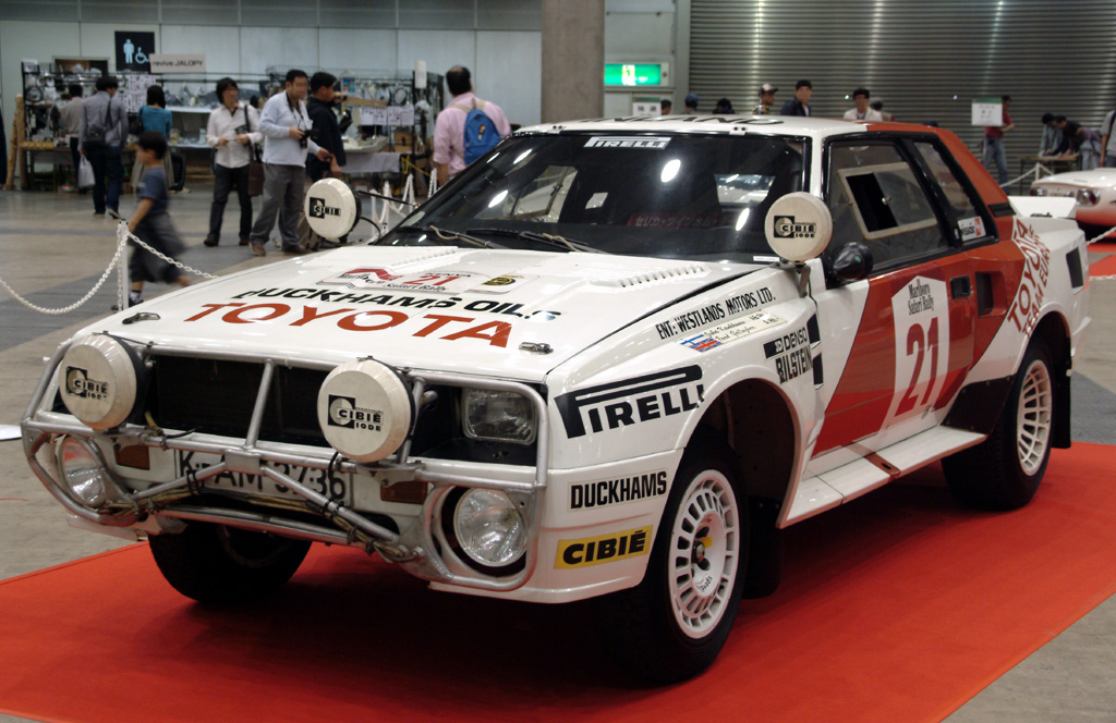
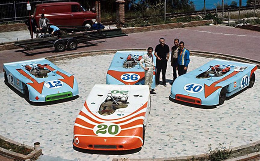
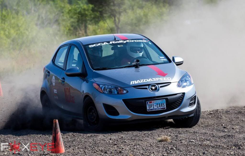
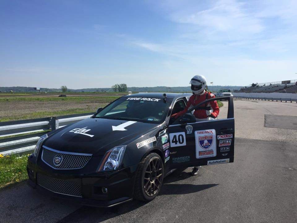
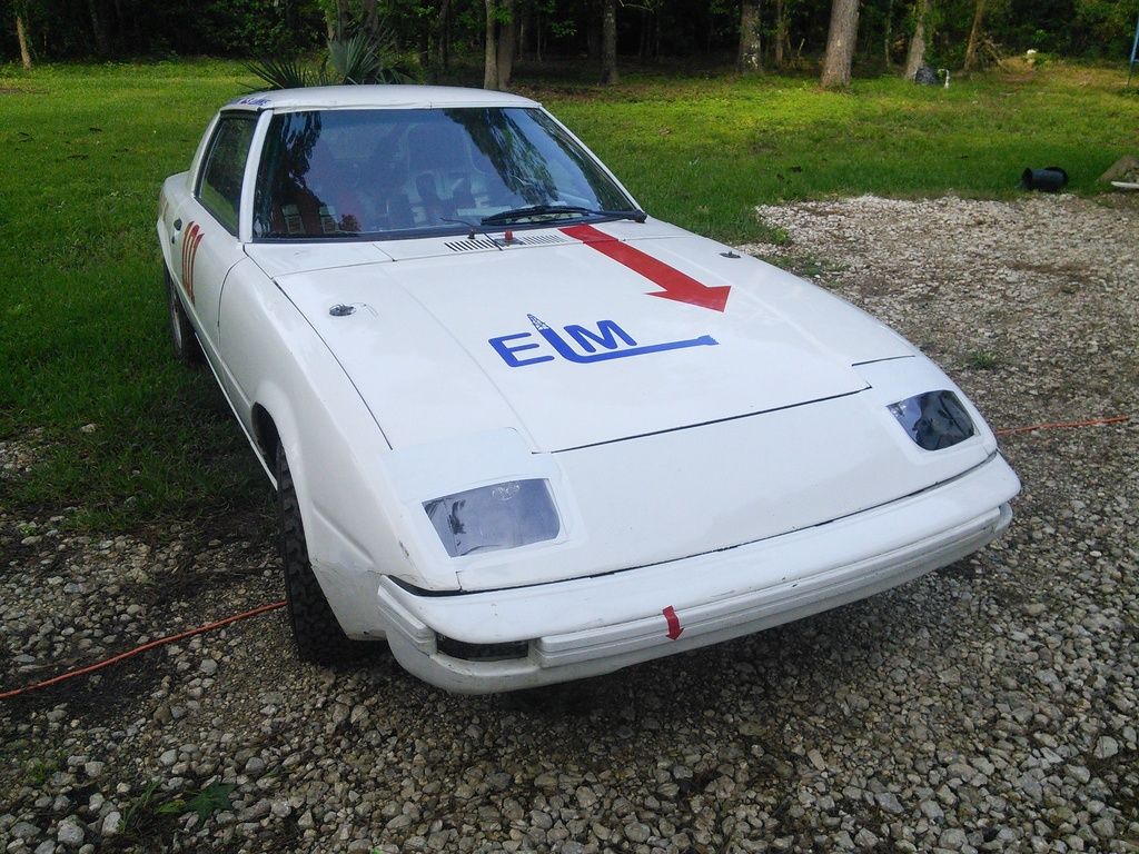
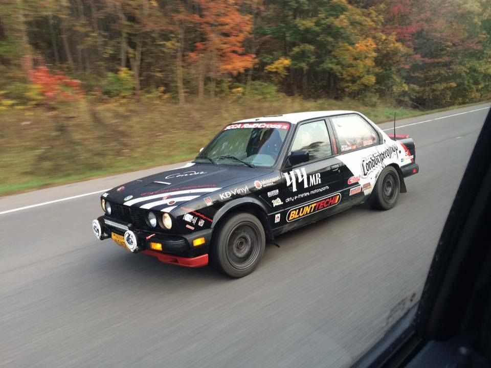
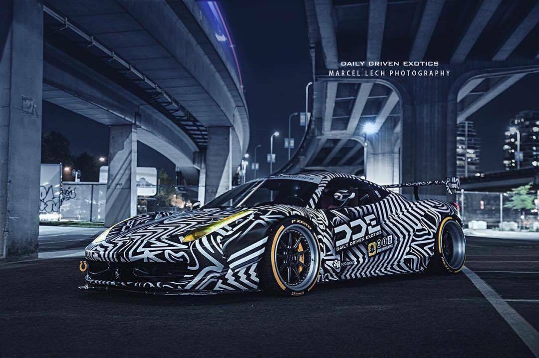
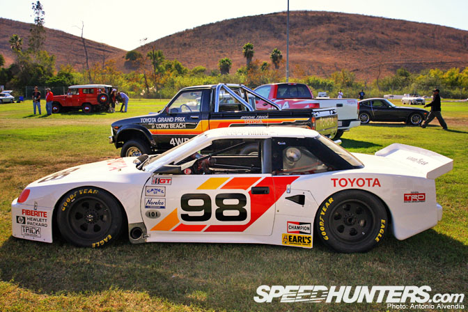
You could have the slowest turd on the course, but dammit if they don't all look incredible.
Is there some kind of trick to a good livery? I've noticed it's always one main, one secondary, and then usually one very limited sprinkle of a third color.
Rarely do you see a mono-color with emblems.
But then there are vehicles like the Gillet vertigo. That blue and green livery is insane.

Rufledt
UltraDork
5/1/16 12:01 a.m.
I've heard one warm color, one cool color, one neutral color, in addition to your main, secondary, accent scheme. Which one is which doesn't matter i.e. neutral can be primary, secondary, or accent.
How about the shapes? Some accent body lines, some just appear to be odd blocks, or a big diagonal line cutting the car into two different colors, some are racing stripes that fade in or out, some are busy, some are simple. How do you decide what to use?
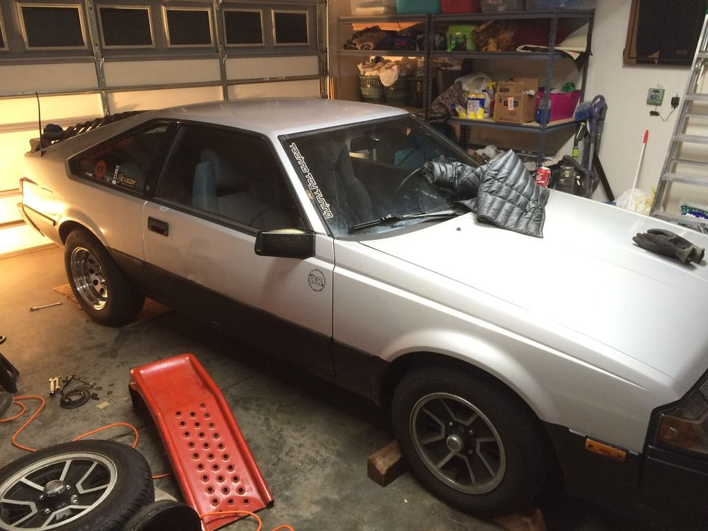
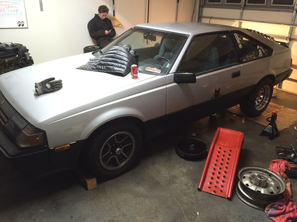
My Celica is very 1985. It looks like an origami box, so it's shaping is very simple. Does that mean I should go complex with the shapes? Or do I match it, and go with simple blocks or shapes? I'm an artistic person, very good. But I need education in the livery business.
lancia had a very distinctive livery when they took the 037 road racing.. it was black and white flowing stripes
 In reply to RealMiniParker:
Sigh.
Three-square-box cars often look good when bisected with a diagonal color separation line, primarily because they don't have much in the way of naturally pleasing shapes that can be high-lighted with contrasting colors.
Consider using the Golden Section (3 to 2) rule for biseceting your car with a diagonal. I looked at some photos of the notchback Celica, and I think starting the diagonal at the upper-rear corner of the trunk and running down to the bottom-rear corner of the front wheel arch would be very close to Just Right. Whatchu think?

This is the notch back. The hatch back is what I've got. I'm really not a fan of this wrc Celica. Too bland.


This what I'm currently working with. Sorry. Last minute pics after a project.

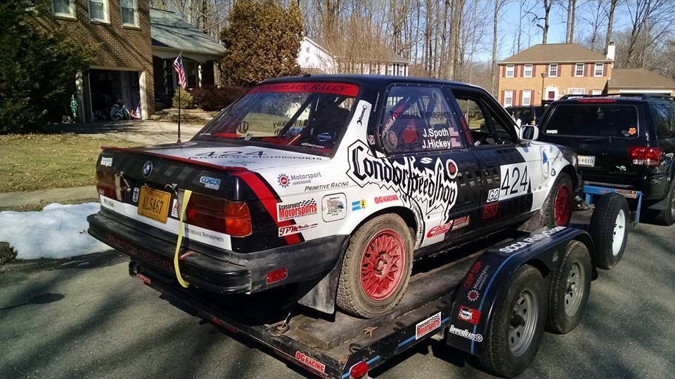
back when my car was mostly black and white, a pro photographer at an event told me I should add more color and graphics if I wanted photographers to take more pics of the car. So I painted the wheels blue and the front lip blue lol. Since then I got rid fo the blue and since I have red Sparco seats, I did the whole cage/interior in red as well as some exterior details.
I think it's boring to just keep the same graphics though so I'm constantly tinkering and changing stuff - either with spraypaint and masking tape, or using my little vinyl cutter.
I'd love to get an awesome wrap, but since I always want to change things I'd get annoyed with that too soon, lol. I do have my sponsors send me new vinyl and stuff here and there when I sand down a hood or a panel or something, and always ask for a new design.
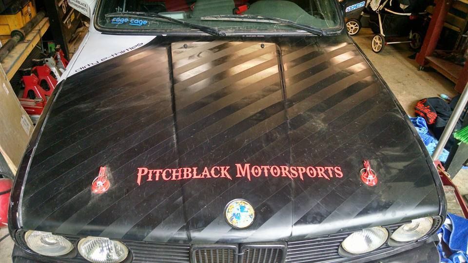
The black and white are still predominant and don't "pop" like many other cars (especially rally cars), but my team is "Pitchblack Rally" so can't exactly go too far away from the black lol...


new hood will have a big sponsor logo across it soon. The "ghost stripes" are my new favorite thing lol

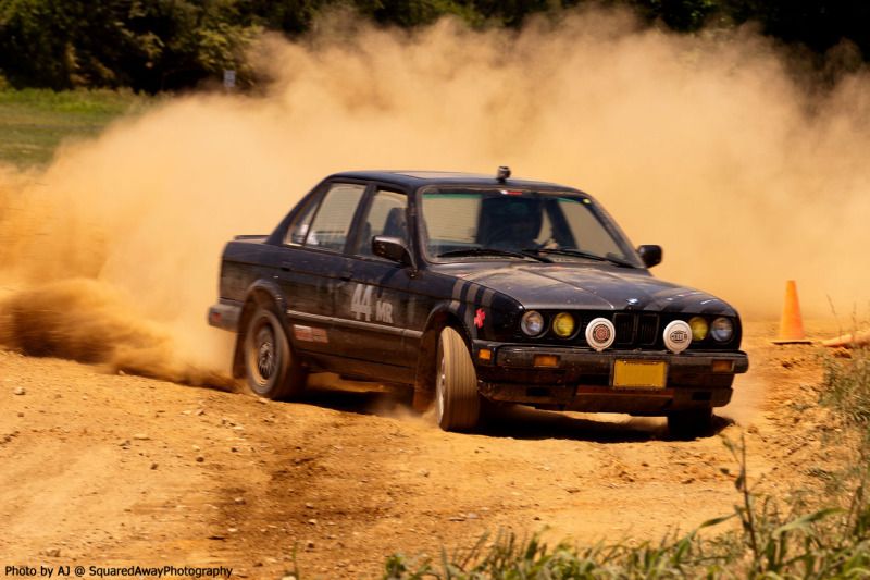
That said, I have also gotten more "racecar" looking as I got better. First year with this car it was pretty basic. As I got faster and started winning, I felt a bit more confident about making it actually look fast :)

Here's mine. Used the classic M3 lightweight graphics, they fit since the wing is a M3 lightweight wing...
In reply to Trackmouse:
When I look at your car I see a scheme inspired by this:

Maybe a black to red to yellow stripe of some sort down the sides?
I help reading "Turd" whenever I see a TRD decal on a truck or car. Am I the only who does this?


oldtin
PowerDork
5/1/16 2:59 p.m.
nderwater wrote:
I help reading "Turd" whenever I see a TRD decal on a truck or car. Am I the only who does this?

Me too, keep wondering why people would pay for a turd sticker
This one I blatently stole from the BMW touring cars of the 80s and 90s like docwyte ;) The gray bumper was omage to the car below... and also happened to come in that color from the supplier ;)

This one... well... I had a lot of black rattle cans and duct tape. And red nets. The gray hood was just the prime that came on the fiberglass.

But... I need to get a new action pic because it just got fender flares, widebody side skirts, all new lexan and some other "improvements" like washing it and such.

LanEvo
Reader
5/1/16 6:18 p.m.
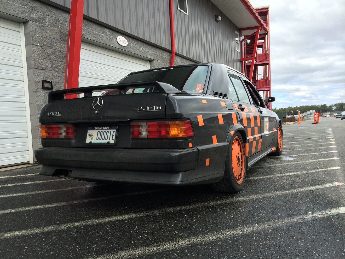
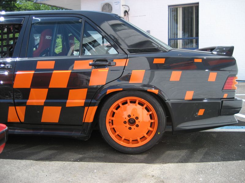
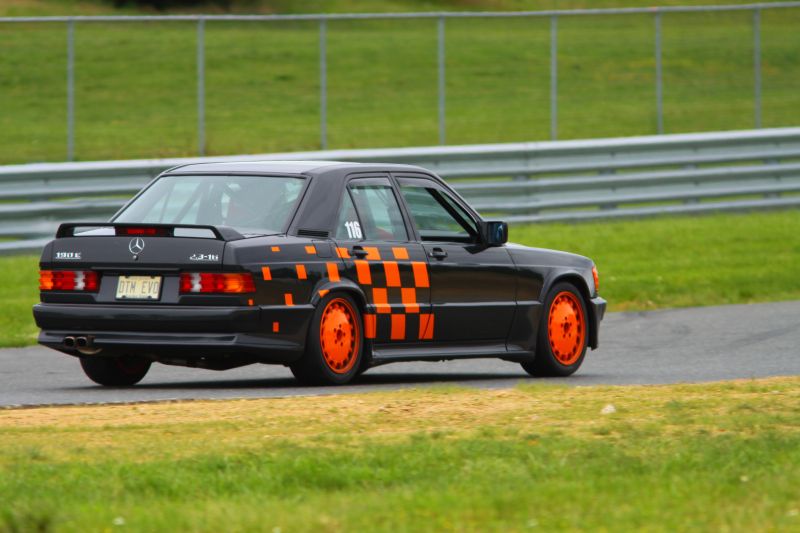
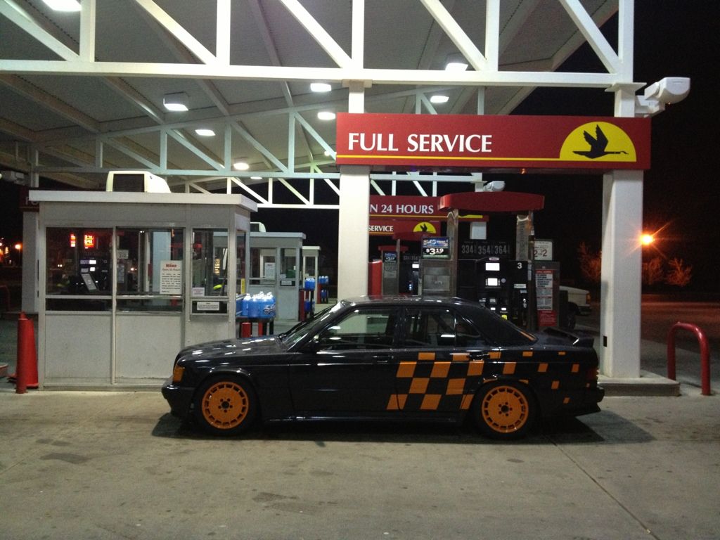
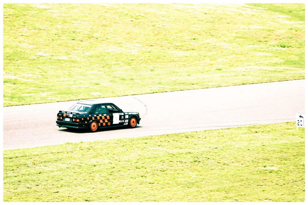
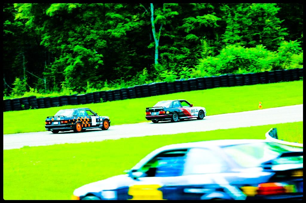
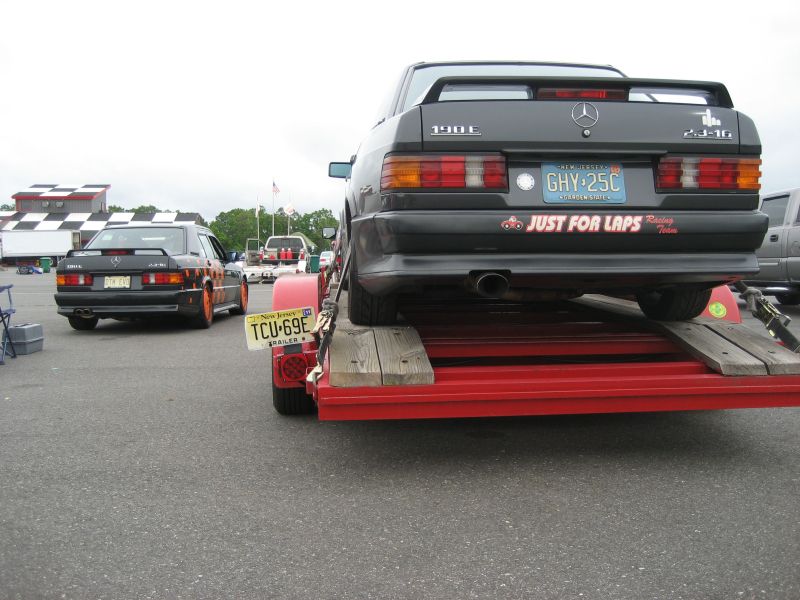
Graphics should be big and bold so that they make sense when the car is at speed and people are taking photos from trackside. Here's mine...


The problem is, I didn't really think it through. Once I added all the required series sponsor stickers, the whole thing looked messy...


Need to find a better way to integrate them. Still, I think the point stands. Big, bold graphics work best.
In reply to LanEvo:
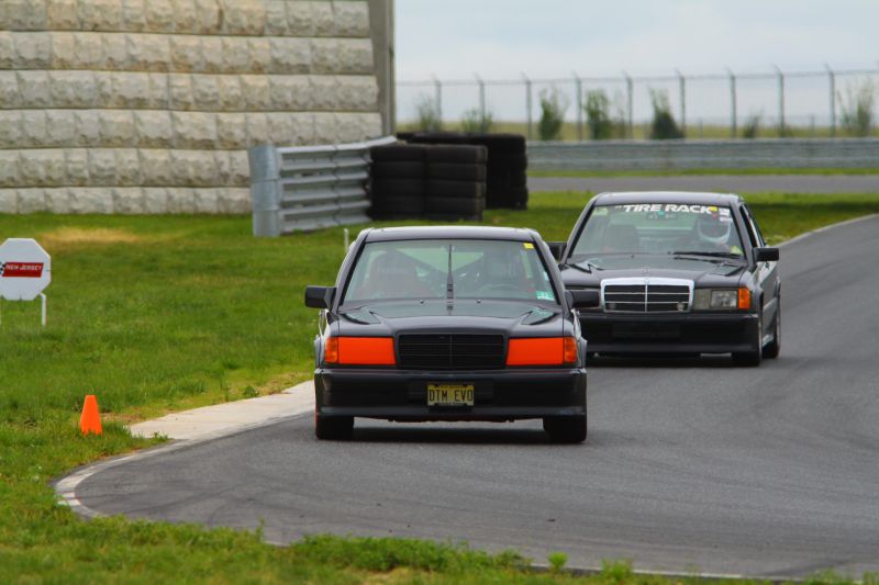
I do believe we did BMW CCA Club Race school together in '10. How many people could there be with a 190-E track car? I was the one driving the #54 E30 (above) with no exhaust.

LanEvo
Reader
5/1/16 8:37 p.m.
Huckleberry wrote:
In reply to LanEvo:
I do believe we did BMW CCA Club Race school together in '10. I was the one driving the #54 E30 (above) with no exhaust.
That would be me. I did the CCA CR school at Mosport and NJMP-Thunderbolt. I don't remember if the car was all stickered up at that point (probably not). Tons of fun.
Huckleberry wrote:
In reply to LanEvo:
How many people could there be with a 190-E track car?
There is at least one other 190E Cosworth track rat around here. I don't think he races it, but he does track events in the northeast.


I like printing off a bunch of side silhouettes of the car I'm trying to design for and then just break out the coloring pencils and try out different things. I'll search google for ideas and then adjust them to that car. A lot of times I end up going with a modified version of older designs from factory teams.
Like for your car I would probably go with the Toyota TRD colors in some scheme.


In reply to LanEvo:
Well, then... are you a tall thin Italian looking guy with a big tuft of black hair? If not... it's the other guy ;)


 In reply to RealMiniParker:
