Huckleberry wrote: In reply to LanEvo: Well, then... are you a tall thin Italian looking guy with a big tuft of black hair?
Nope. Guess it's the other guy.
Huckleberry wrote: In reply to LanEvo: Well, then... are you a tall thin Italian looking guy with a big tuft of black hair?
Nope. Guess it's the other guy.
You can't be an artist without trying to do things that don't work. There are no correct images, designs, or a set way a car should look. The suggestion to do some side view sketches is a good idea. Or even some three quarter views. Handy with a xerox machine? Make lots of light copies and draw, color, paint, or bleed on them. Anything. Just do it. You won't grow as an artist if you are unwilling or afraid to just get started. Often times the end result comes from a place unexpected. Rodin called them happy little accidents.
Personally, I love the car you have and think it's origami styling is a plus. Consider the car's origin in the design perhaps?
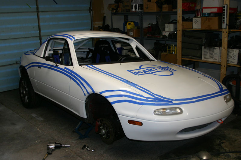
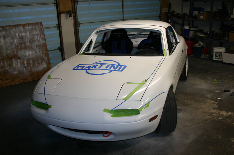
If you want to get it right, you need to try it on the car. I tried a bunch of sketches on how the Martini livery would drape over the Miata, but what made it work was laying out tape, walking around the car, tweaking the tape, walking away for a day, tweaking the tape... it took me a month. Big changes like how they'd start and stop or deal with the roof, and small changes such as the arc on the door.
First layout
 Final masking
Had the same thing happen with our 2015 SEMA car. Koni did the initial livery design, but when it came time to lay it on the car it wasn't quite right. I made a couple of changes, most notably to how the stripes were shaped at the front to play off the lines of the car. I also decided to highlight some of the factory parts in red and add some extra graphics at the rear quarter. The stripes and red factory parts are the two aspects of the livery that get the most comments, and both of those came from looking at the car. They're so successful that we put the same stripes on our other ND Miata and we'll be adding the red aero as well.


Personally, I think a good livery is one that's big and graphic and bold and that accentuates the shape of the car. Something that's too busy isn't effective, and what looks good on one car won't look good on another.
Do you want to paint the whole car or just add to the existing paint?
Trackmouse wrote: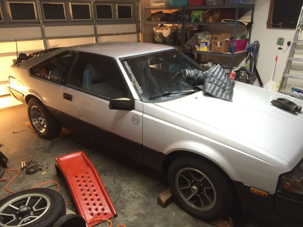
This what I'm currently working with. Sorry. Last minute pics after a project.
In reply to JohnRW1621:
I'd like to use the existing silver. The black on bottom is just plastidip, and is mainly there the protect against road salt.
I do love the old Celica trd theme, I just don't know how yellow, orange, and red will look with silver...

An example of 'just because you can does not mean that you should' - even my 80's Trapper Keepers were never that wild.
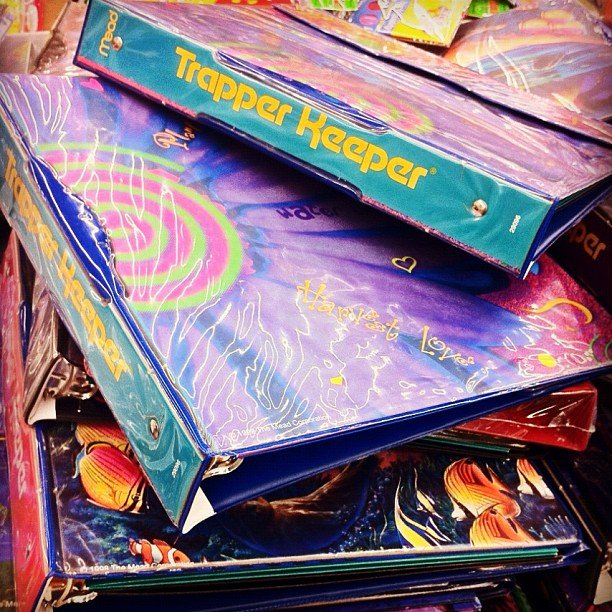
Someone needs to do a Trapper Keeper livery; have a giant grid pattern on the car and a F14 Tomcat on the hood! That would be so rad...
nderwater wrote: An example of 'just because you can does not mean that you should' - even my 80's Trapper Keepers were never that wild.
It's a dazzle paint job, makes it harder to figure out what they are and what direction they are going:

That's the danger of wraps. It's so easy to go nuts with designs and colors that you forget the fundamental principles. Red Bull in particular is bad at this. Seeing a Red Bull F1 car on track along with a Martini Williams really underscores the difference.
I've always had a soft spot for the BASF design. Very distinctive and it's obviously the sponsor's logo.

Trackmouse wrote: In reply to JohnRW1621: I'd like to use the existing silver. The black on bottom is just plastidip, and is mainly there the protect against road salt. I do love the old Celica trd theme, I just don't know how yellow, orange, and red will look with silver...
A spin off of the design but a different color pallete might look good. Here's a good example of a classic VW Livery reimagined in a different color palette that works just as well.
The original:
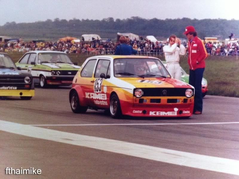
And the spin off design:

I think you could do a similar spin of the TRD design with a tricolor blue pallete over silver.
WildScotsRacing wrote: Three-square-box cars often look good when bisected with a diagonal color separation line, primarily because they don't have much in the way of naturally pleasing shapes that can be high-lighted with contrasting colors. Consider using the Golden Section (3 to 2) rule for biseceting your car with a diagonal. I looked at some photos of the notchback Celica, and I think starting the diagonal at the upper-rear corner of the trunk and running down to the bottom-rear corner of the front wheel arch would be very close to Just Right. Whatchu think?
The Golden Section / Golden Mean is actually 1:1.61803.

I'm thinking a simple 2-tone might work, sort of like. Keep the silver and black, but add more black on the top, starting at the body line at the top of the fender/doors.

Or you could do a different color on top, maybe a nice blue.
In reply to Duke:
That brings back memories. It's a Fibonacci spiral of which the Golden Mean is one example. I used to work for a company that thought it made a cool logo back in the 90s. I think I might have been smarter then.
In reply to Duke:
Yes. But, it's much easier for the average person to visualize the ratio by multiplying by 2 and roughly rounding it.
Here are some thoughts with keeping the silver.
This picture is a pretty good representation of what you have.
You are currently silver and black. I think your key 3rd color should be red and a slight homage to TRD.

From the side view mirror, traveling forward you sort of have an arrow line at the top of the fender, maybe 4" tall at the tallest. I would add color (and the homage to TRD) in just this portion. You said the lower valance is Plasti so you are familiar with that product and this could all be done in Plasti too. Vinyl may work too or a combination of the two.
Starting at the front turn signal and till half way over the wheel well, I would make this stripe white, the the proper angled line/space to a slight bit of yellow and then space/line orange then space/line red continuing to cover the entire mirror in red.
What you have then is a slight bit of white, some yellow and orange (and the space dedicated to yellow/orange is even smaller than the space dedicated to white) with a large patch of red.
Somewhat similar to the door sill stripe here but imagine the whole thing moved to the front fender.

Elsewhere on the Celica, add as much red as you like.
Go big with red wheels.
Go smaller with a red windshield banner.
Maybe a red rear spoiler.
Maybe red numbers or red number on a white background or red or white numbers outlined in red or white.
Star Wars car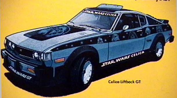
No. Just no. I like Star Wars and I love my Celica, but never shall the two meet. Race warz>space warz.
You'll need to log in to post.