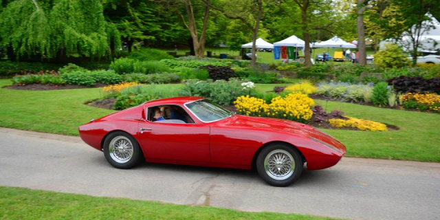
It looks like a ’60s Italian GT coupe. Or maybe even a Cobra Daytona–well, aside from the doors.
What is it? According to the Facebook Marketplace listing, we’re all looking at a 1965 Fiberfab Banshee/Caribee body mounted on a 1959 Triumph TR3 chassis. (When GM purchased the Ban…
Read the rest of the story

nocones
PowerDork
11/9/23 10:44 a.m.
I saw that. I literally don't think I could get in through that door opening. But it does look very nice.

NOHOME
MegaDork
11/9/23 10:47 a.m.
Glass included or at least a glass donor?

johndej
SuperDork
11/9/23 10:50 a.m.
Fiberfab Banshee, I think someone on here might have owned one once upon a time.

nocones
PowerDork
11/9/23 10:51 a.m.
In reply to NOHOME :
It says it uses C2 Corvette windshield. The rest would be easy to make out of lexan.
I always thought those old-school fiberglass jobs would be fun to restore/make into your own.

NOHOME
MegaDork
11/9/23 11:18 a.m.
wiki:
Banshee/Caribee[edit]
In the mid-1960s Fiberfab was developing a car to be called the Banshee. It was designed by Russell and Chris Beebe, although they suggest that the mold maker made unauthorized changes to the final shape.[4] During the car's development General Motors (GM) approached Goodwin and bought the Banshee name from him.[4] GM would use the name for their Pontiac Banshee line of concept cars, starting in 1964. The Fiberfab car was renamed the Caribee.
The Banshee/Caribee had gull-wing doors and styling that has been compared to a Shelby Daytona coupe.[30] The body was made to be fitted over a variety of front-engine chassis, including ones from Triumph, MG and Austin-Healey.
Twelve copies of the car were built.[30]
Stole this image from FB showing what it might look like further down the road


I would build and drive that.
If only it was closer....
Here's another example of a Banshee: https://rarecomponentcars.blogspot.com/2021/03/the-novetta-sports-racer.html
There's a youtube video on it somewhere.
I wonder if that could be built in a way that an be legal for vintage racing.

wspohn
UltraDork
11/9/23 1:11 p.m.
The doors are very narrow and restrictive. It was Fiberfab's attempt to create an exotic, but they actually made a less comfortable/useful car than the basically similar Jamaican which also looked more as if it really was a production car as opposed to some kid's wet dream.
I think the Jamaican looks much more as if it were an actual production car:

I don't think it's particularly attractive and building something based on a chassis designed in the 50s........
It looks like a somewhat over-inflated 250 GTO.

kb58
UltraDork
11/9/23 2:27 p.m.
Ugh... I can never understand the thinking when styling a car like this. "Let's see, we want it to look Italian, so lots of sweeping curves. Great, we have that now, so what about the doors? Meh, just do whatever, square corners are fine..."
No, no, no, if curves dominate a design, they need to carry through on all parts. Curves clash visually with square-cornered anything.
In reply to wspohn :
Yes, the Jamaican is rather stunning.

kb58 said:
Ugh... I can never understand the thinking when styling a car like this. "Let's see, we want it to look Italian, so lots of sweeping curves. Great, we have that now, so what about the doors? Meh, just do whatever, square corners are fine..."
No, no, no, if curves dominate a design, they need to carry through on all parts. Curves clash visually with square-cornered anything.
Yes and no. I do this for a living. Sometimes you need straight or taut lines and tighter radiuses in corners to keep the design from looking too "doughey". Also, a car is always seen against the ground so you need to remember that there is a relationship between the two. A couple lines or surfaces that are relatively square to the world help cement that relationship in a good way.
The problem with this car isn't the basic shapes. It's proportions. The wheels openings are too small compared to the rest of the body. The doors are too small. The fenders are a little too tall. Tinker with those and it's fine.
Took the red image and made some fixes. Increased wheel well size a little. Increased wheelbase a little. Moved the windshield forward about 7-8 inches (In reality) with a corresponding increase in door and side glass size. Nothing else altered in the shape of the car.


