I've noticed two styling trends in the last few years that were ugly when they were released, and are only getting worse with time. I'm not talking about the vehicles as a whole, but in this case the fugly grills. I mean, the Charger SRT8 and Veloster turbo look like two of those kissing fish we had in our aquarium when I was a kid.
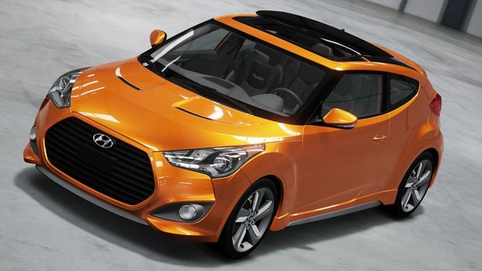
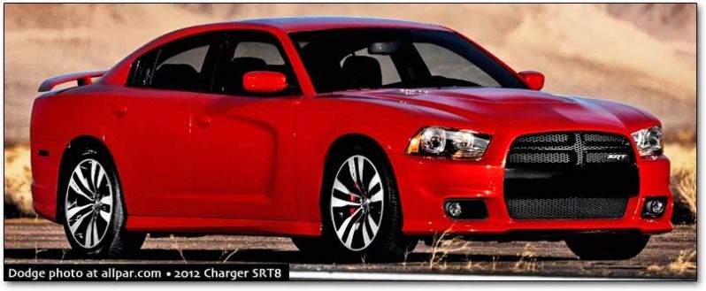
If only they'd have a strip of color in the middle or something. That would make it better Lexus put a strip of color in the gaping maw of a grill, but then they styled it after an alien.
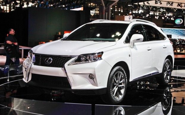
Out of the three though, the SRT8 is the best looking.
That is all, just an observation.
I blame Audi for the "gaping maw" trend. Some of theirs look ok but others ....meh.
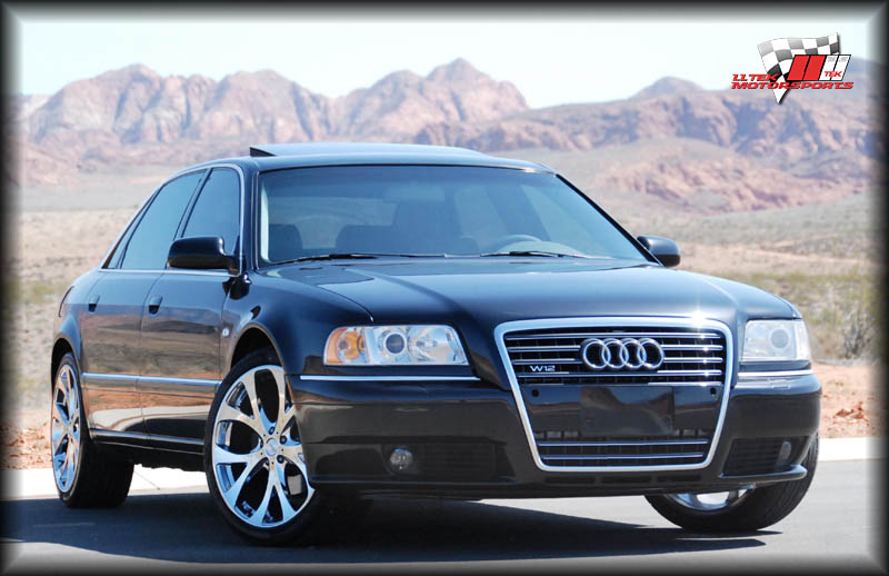
Ugly Grill thread without a reference to Mazda. Interesting.
Gaping grilles, 18" and larger wheels, beltlines so high you can barely see over them, dashboards that are three feet deep to the base of the windshield, stereos with 400 buttons when all I want is one knob for the volume and one knob to change channels.
I think it was Bob Lutz who said today's cars look like angry kitchen appliances. :)
The Hyundai Sonata Hybrid has the worst case of gaping fishmouth grille:

The Aston Martin 1-77 started the folded headlights thing which doesn't look bad on this car but is easy to get horribly wrong:

Then there are the bigass fender bulges that make any wheel look small, a lot of the boring new American sedans that I can't even remember the names of have them.
And thank governments for mandating all this stupid ugly crap. People NEED to die. No mandated "safety cocoon" is going to out and out save everyone in every crash.

JoeyM
SuperDork
8/1/12 9:14 a.m.
....anything Nissan has touched in recent years. (...and I hate saying that. I love old Datsuns.)
http://www.insideline.com/nissan/juke/2011/2011-nissan-juke-priced-from-under-20000.html

http://www.belovedcars.com/worlds-most-ugly-cars/

http://content.usatoday.com/communities/driveon/post/2012/06/nissans-sales-disaster-ugly-murano-crosscabriolet/1#.UBk43vZlRhE

http://www.thetruthaboutcars.com/2010/02/whats-wrong-with-this-picture-searing-retina-damage-approved-for-the-american-market-edition/

I like the veloster and can't stand the lexus. I wish they would get away from the giant pimpin' wheels. I like my cheap 15"&16" tires.
The gaping maw grill has been building in momentum over the years. I think Audi started it but it's spread to Chrysler, Mitsubishi, Hyundai, Kia, Honda, almost everyone has a car with it. Ugh.

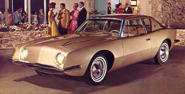
I think Studebaker showed us that cars to indeed need a grill.
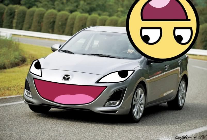
And yeah, Mazda needs a slap in the face for taking what was a nice looking range of cars and making them all overly happy. Thanks for reminding me failboat.
Don't forget the Geely Englon!

Not a huge fan of the way oversized grill trend either. I agree a grill is an important part of the styling of a car, but it shouldn't stick out like a sore thumb.
This is the only grill I want that's way oversized....

Oh man. I saw another Murano convertible last night in some weird 'taupe' type color. I was queasy for about an hour afterwards. I'm pretty sure this was the color.

http://www.autoblog.com/2011/08/11/nissan-murano-crosscabriolet-named-most-disliked-car-of-2011-w/
I can't say I think the Murano 'vert is ultra ugly, so much as it's ultra pointless. I've only seen one in person, and instead of making me want to vomit, it just made me say "Why??". And of course, the person driving it looked like a trophy wife...which I'll bet is the intended market.
In reply to Klayfish:
Then let me say it for you - It's ultra ugly.
if you look very closely at these huge grilles, one will notice that most of it is sealed off, leaving as little as a third for actual air intake.
Huge (over 18") wheels and even the bigger fender wells can go. Whats with all the chrome on new cars? It looked great in the 50's, but now looks tacked on with no purpose. GM and Chrysler seem to be the bigger offenders of that.

Knurled
SuperDork
8/1/12 12:37 p.m.
stuart in mn wrote:
Gaping grilles, 18" and larger wheels, beltlines so high you can barely see over them, dashboards that are three feet deep to the base of the windshield, stereos with 400 buttons when all I want is one knob for the volume and one knob to change channels.
All this and vertical headlights that extend halfway up the fender. The final-gen Celica was only the beginning of the horrible.
(Addendum: Cars where you can't see the front corners. Most cars, the beltline is so high and the front slopes so much, the car seems to end at the dashboard. Bad bad bad bad.)
Gearheadotaku wrote:
GM and Chrysler seem to be the bigger offenders of that.
I agree. This is one instance where Ford having sleepy stylists has been a good thing.
Excessively tall belt lines and huge wheel gaps on Pickup trucks

I'd like to get stuff in the bed thanks.
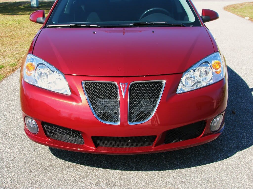
Oh my what big grills you have G6.
SyntheticBlinkerFluid wrote:
Excessively tall belt lines and huge wheel gaps on Pickup trucks
 I'd like to get stuff in the bed thanks.
So basically every American pickup ever made except the Ford Ranger and Dodge Dakota?
I know we've covered this topic by simply saying "Nissan", but what the hell is up the curve on the top of the doors of the Armada/QX56, and how it has absolutely no flow with the rest of the vehicle? It's like they were going to design a sloping hatchback of sorts, then gave up and just put a block back there.

 And yes, I know. The QX56 could be one of the ugliest vehicles ever.
In my mind, the current Camaro looks tons better as a convertible than with the hardtop. I know the high belt line is to increase crash safety or some such governmental nonsense, but it makes the hardtop look like it's been squashed.


 And yes, I know. The QX56 could be one of the ugliest vehicles ever.


