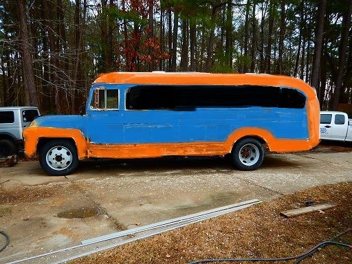
EastCoastMojo wrote:
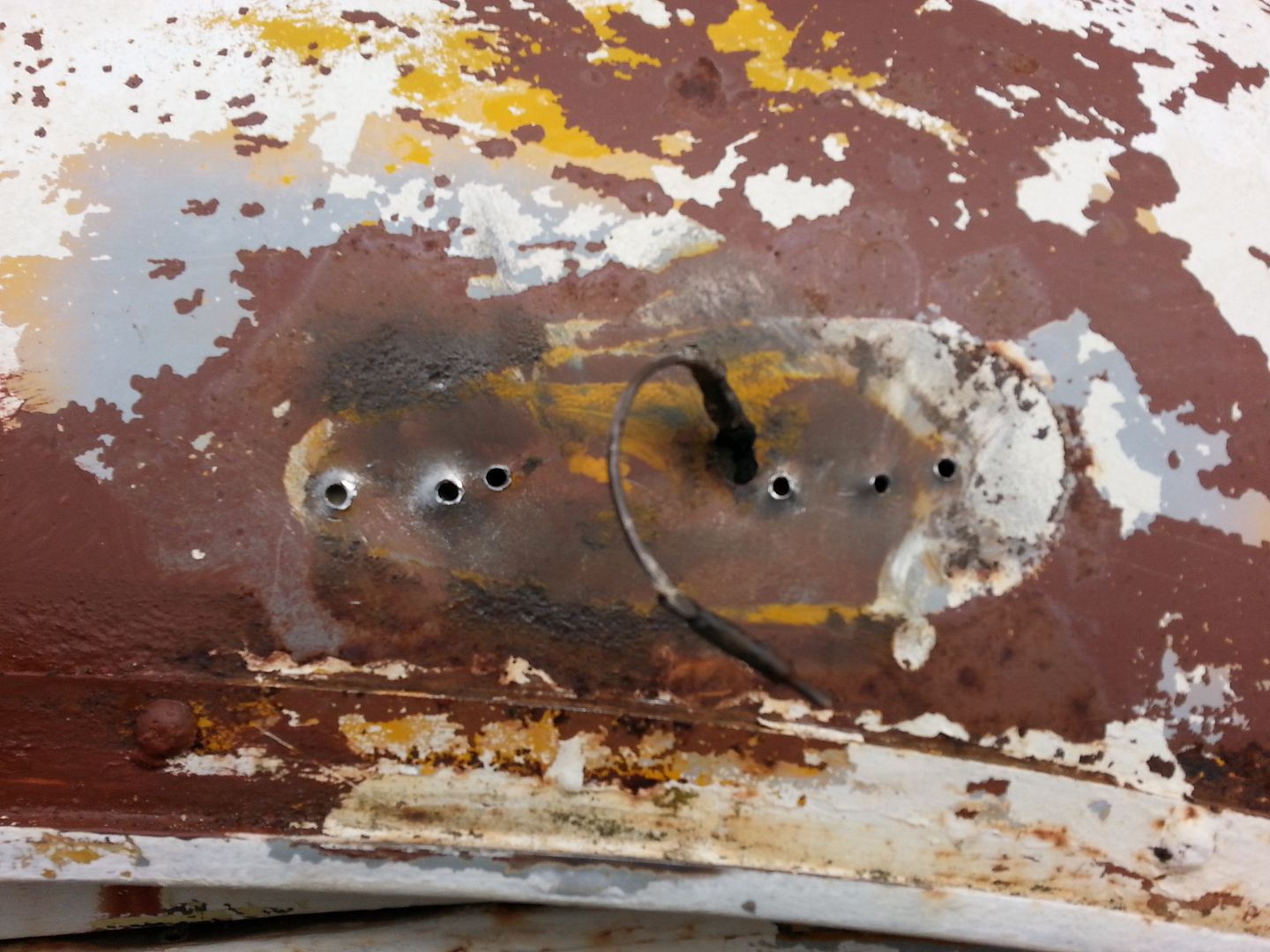
Edited to add: It looks like the emerald gypsy has had the same roof vent repair that you did Toyman 
Well, that's good. I've looked at pictures of that rig a dozen times and never noticed the repair. Maybe mine won't be too noticeable either.

RedGT
Reader
2/20/16 10:09 p.m.
Toyman01 wrote:
EastCoastMojo wrote:
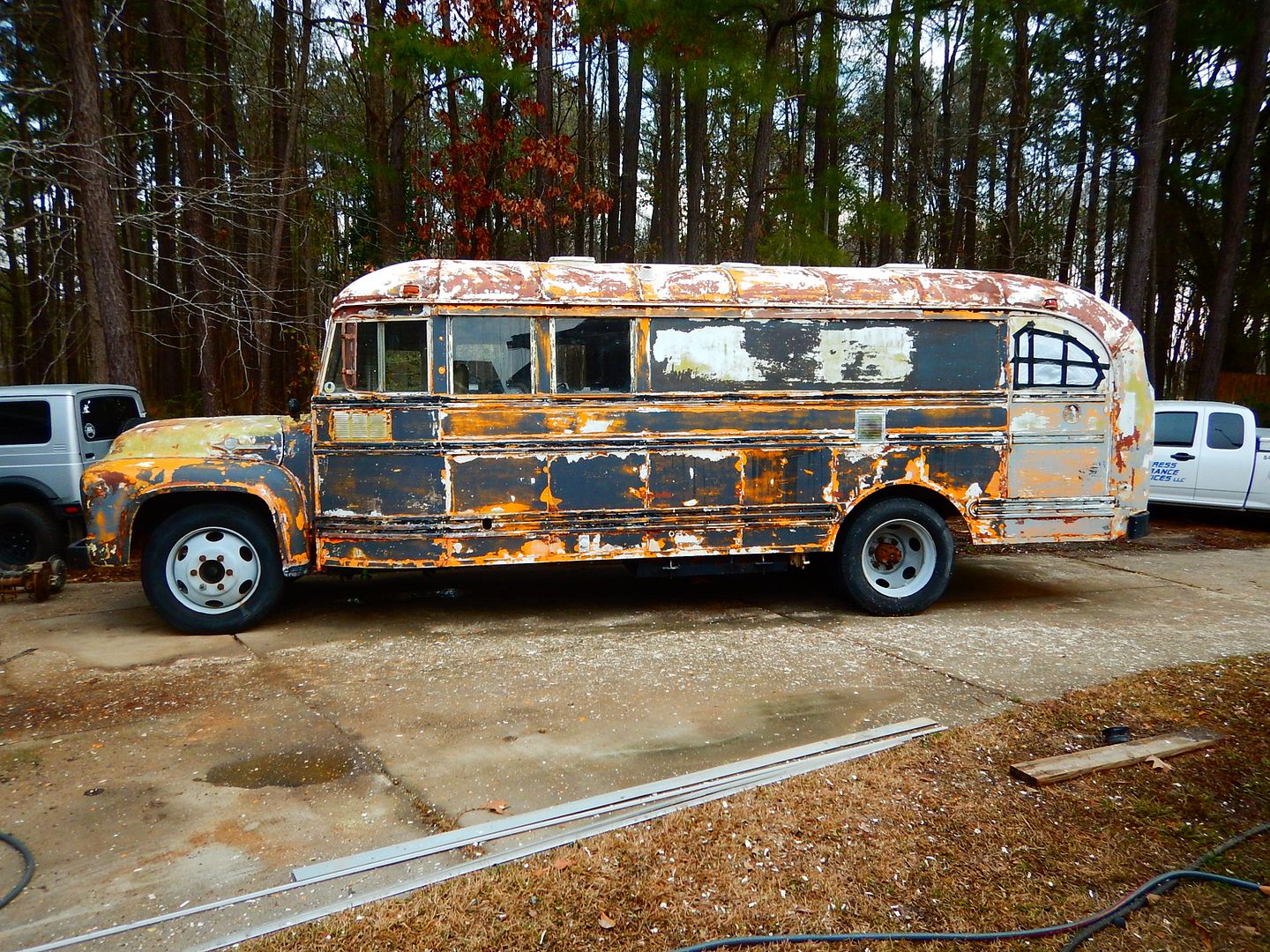
Gulf style livery with the ford blue and kubota orange.
Now that has possibilities.
 I could take the orange from the bottom of the fenders down the bus at the top of the rear wheel arch and then paint the wheels blue.
Do this. Please. Im pictuing like a 6" stripe along the bottom of the side, following over the curve of the rear wheel arch and continuing to the back. 6", 10", whatever stripe width works with the bus proportions.
In reply to RedGT:
I would probably come down the fender and blend it in at the top of the bottom rub rail.
So, white roof down to the drip rail, blue body down to the bottom rub rail, blue wheels. Orange fenders, grill and from the bottom rub rail down. Anyone have photoshop skills?

I think you also need to tint the side glass blacker than berkeley, and follow the black down the side between the windows where the bus windows were filled with sheet metal.
No other livery comes close. I likes where this is goin'.
Really like the orange and ford blue, go with Tractor supply paint and don't forget to add the hardener they sell. Don't ask me why I mention this
Dennis
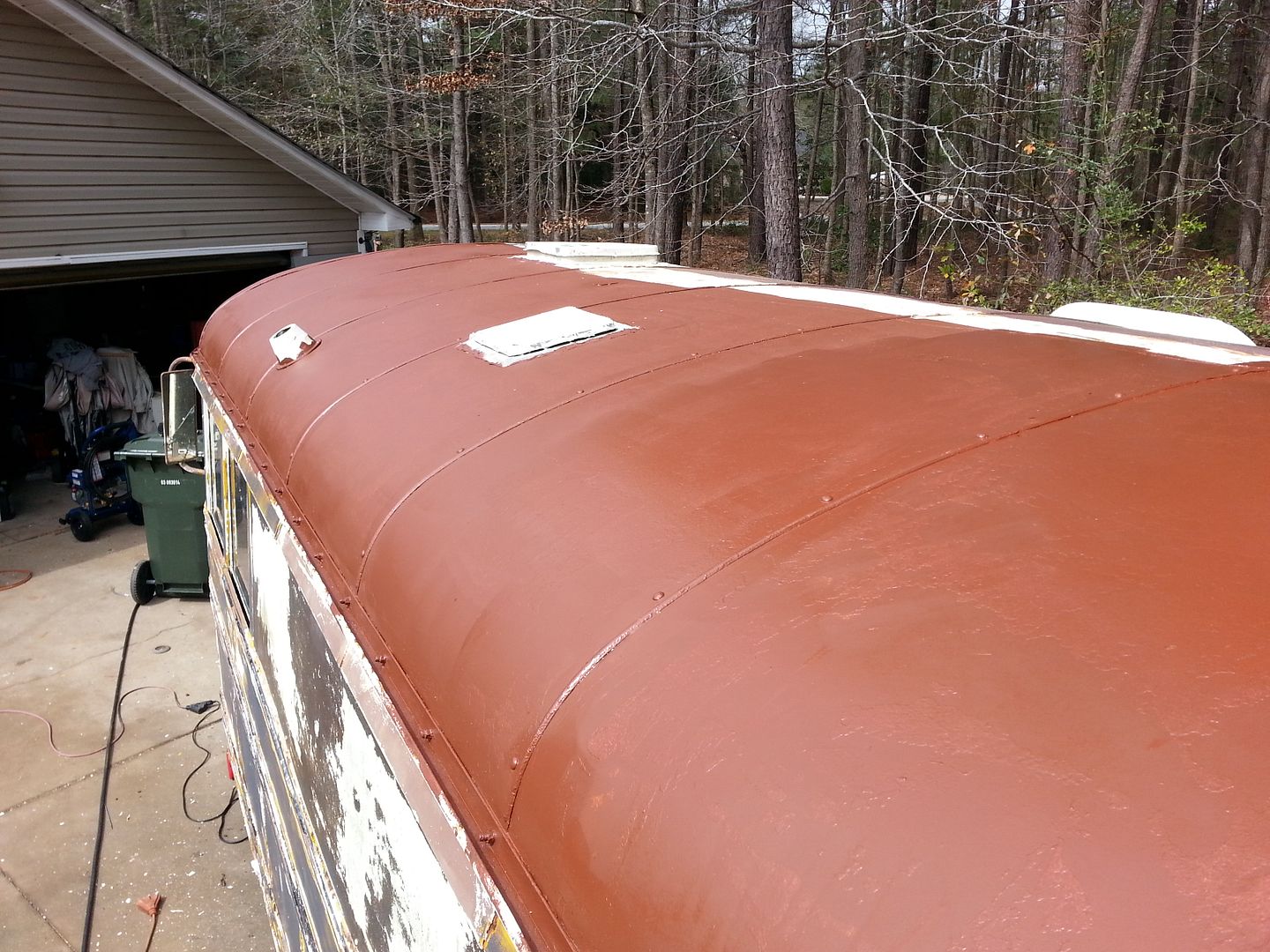
The roof is getting it's primer.

I pulled the ugly old clearance lights and look what I found underneath.

I love me some teardrop clearance lights. That's what will go back for sure.
Golly, you move fast, Mister!
OK, primer on the roof is 95% done. I feel better having that done. Hopefully I won't be able to hear it rust anymore. 

The top coat is next, but not this week. It's going to depend on the weather. It has to be above 50 and I would like it above 70 degrees, for the stuff to cure. In the mean time, I'll be stripping all the vents off to replace and reseal.
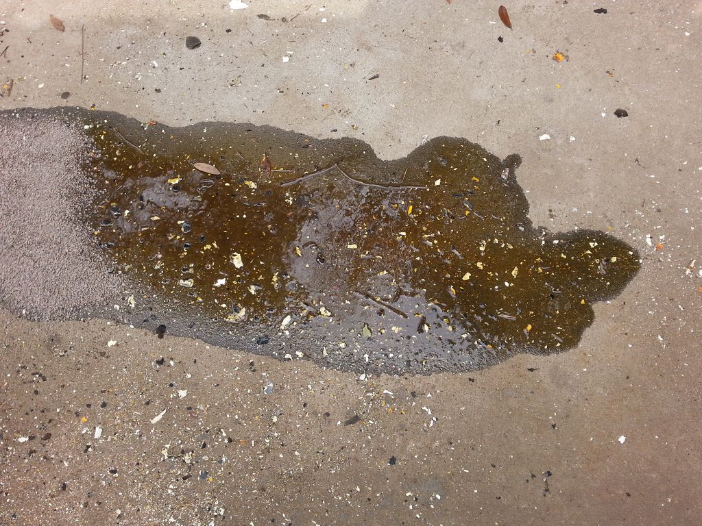
It appears that I have a transmission issue. I moved the bus today so I could paint the other side of the roof. There was a huge puddle of fresh gear oil soaking into the driveway. 

I'm not sure where that's coming from. It sat for a couple of weeks and didn't leak a drop. In the last 24 hours it's lost a cup or more.
If you use the tractor paint from TSC get the hardener ,too. I don't know what equipment you have for spraying paint, but the cover car on this month's issue of the magazine was sprayed with a Wagner electric sprayer.
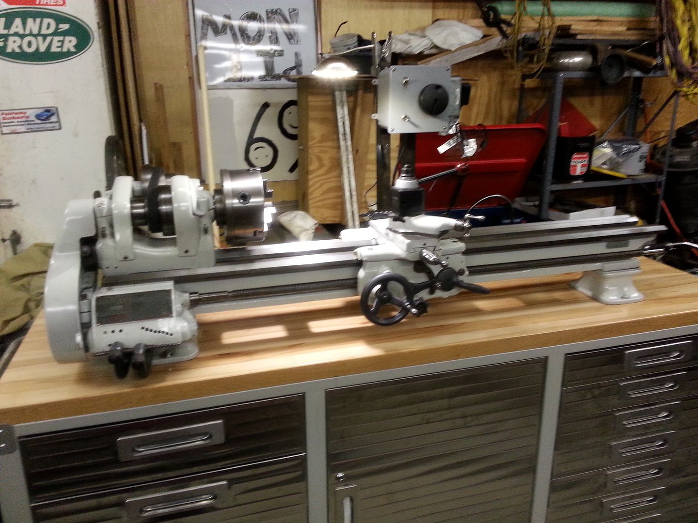
I used the TSC paints with the hardener when I restored my 1947 lathe. I really liked the way it came out.
As far as spray equipment, I've got a Wagner and a traditional spray rig.
This is TSC Ford Gray. It was surprisingly easy to shoot.

If you go with the two tone style, I vote (I am aware that I sold my voting rights, but I am voting anyways :P) that you get a little creative with the paint break. It always looked half ass to me when guys just spray the whole fender on these trucks. They were one of the first models to flow the body panels together. So why would one highlight the panel breaks?
This is one of the ways it should be imho:
https://s-media-cache-ak0.pinimg.com/236x/e3/27/b4/e327b43c5d40220063f8a27949f76d02.jpg
Not this:
http://www.jalopyjournal.com/forum/attachments/beatersville-2014-2-jpg.2628001/
Thank you.
P.S. I am super happy to see progress being made.
Long live Sanford the Great!
In reply to Youngbloodcustoms:
That's a pretty good idea.
Youngbloodcustoms wrote:
If you go with the two tone style, I vote (I am aware that I sold my voting rights, but I am voting anyways :P) that you get a little creative with the paint break. It always looked half ass to me when guys just spray the whole fender on these trucks. They were one of the first models to flow the body panels together. So why would one highlight the panel breaks?
This is one of the ways it should be imho:
https://s-media-cache-ak0.pinimg.com/236x/e3/27/b4/e327b43c5d40220063f8a27949f76d02.jpg
Not this:
http://www.jalopyjournal.com/forum/attachments/beatersville-2014-2-jpg.2628001/
Thank you.
P.S. I am super happy to see progress being made.
Long live Sanford the Great!
But what of the painted fenders looks better?
Your example shows a truck with amazing curves, and a paint job that ignores those and has a straight line. Gross.
In reply to lnlogauge:
I don't know, I definitively don't hate it.

To settle this paint debate somebody needs to make up a white bus template (with body lines and rub rails intact) from this and an opposite corner shot, then things can be easily played with.
Toyman01 wrote:

In reply to lnlogauge:
I didn't say that one was perfect. I will do some things differently when I do my F100. I'm still not totally sold on two-tone all together. Buy I agree, if one was to paint like said black one, I would like to see the paint line on the hood have some matching curves to highlight the fender line. I can not photoshop, so you will have to telepathically envision what I am imagining. LoL 

Chadeux
New Reader
2/22/16 9:00 p.m.
I'm still liking the orange fender two-tone plan, if only because the bus body doesn't flow with the fenders and hood like the pickup cab does.
Toyman what primer did you use?
In reply to DatsunS130:
Rustoleum, rusty metal primer. It is what the roof coating recommend.


Here are my paint ideas.
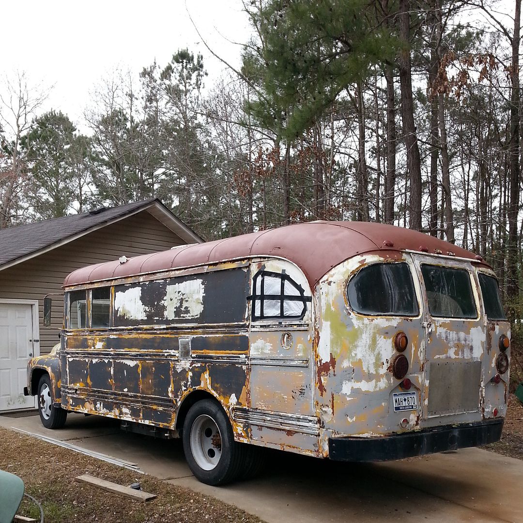
I would continue that white roof all the way down to the black rear bumper. I think this would do a better job of highlighting "dat ass" and the graceful curve of the rear. As shown right now, I dislike the "point" where the primer (and would be white) ends. Strangely, that point reminds me of the front of Eddy Munster's haircut.
Rear glass looks to be dark tint currently and should remain tinted. Black like limo for both heat reduction and privacy. The patched side window should also be black. Continue the flow of not really noticing if windows are there or not by making the whole center window area black, including the uprights.
I'll use this Minivan as an example, see how the entire window area is "black" weather that is glass or black paint.

Rather than this where every window is separate. (same van)


Above the glass there is a small window sill like where the side mirror mounts. This area should not be black but rather should be a color. Same color top and bottom. The color that I choose here is Light Ford Grey.
Staying with the driver's "door" area, I would continue this light grey down low enough that the entire vent grate is in that color.
That line at the bottom of the grate also is in-line with the badge on the engine hood. Continuing the line there could then give you the result like you see on the hotrod truck.

So to recap, white roof extending all the way down to the rear bumper.
Blacked rear window glass and then the side creating a whole black section with glass and paint. On this black "void" windowless portion, you can later add your mural weather that be inspired by '70's van murals or the side of the Smokey & The Bandit Semi. 
This then leaves the lower section for your color of choice.
So far, there is no real color added, rather the lack of color, white/black/gray. The next color you add will be the color the bus is known as. I choose Ford Blue but you may choose differently. In my case, you could point at the bus and tell people, "that blue bus over there is mine." The reality will be that less than half of the bus is actually blue but it will be the defining color.
Wheels could be white or Light Ford Grey but not the defining color.

Feel free to use any, all or none of these ideas.
They are just that, ideas.

RedGT
Reader
2/23/16 8:35 a.m.
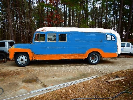
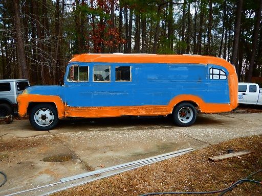
So I do not have photoshop access but I was screwing around on the tablet last night. Feel free to mock me. 

I don't like the white roof. Because of the lines at the rear, I had tried leaving the ass white too like JohnRW just posted. Not a fan.

Tried going with orange for the whole roof and I think it looks less 'threw a few buckets of paint at it' and more connected, but still not sure it looks 'right'.

However the huge wall of orange in front of you on the highway would be pretty cool.
Also imagine the colors are those of the Mack posted above - didn't have much luck choosing custom colors on the dinky screen.
I'd say the front fender orange, and the white for the roof and the bottom line.
Rear should have some sort of cascade of the colors going up.
I would just do the blue and a solid stripe of the orange between the rub rails. From bottom to top, blue until the rail 1 foot or so up from the bottom. Orange until next rail, then blue again. Carry the stripe forward somewhat disregarding following contour of the fender. As noted, do something to blend the points at the rear of the roof (perhaps overlay some blue so its not as sharp of a point?
You want the orange to be less than the blue visually I think. This makes the orange a secondary color to the blue primary and breaks things up some. Keep the paint basic and let the body shape be the body shape, if you try too hard you will end up rather visually complicated. Also, the simple theme may possibly hide dings and dents in the contours better.


 I could take the orange from the bottom of the fenders down the bus at the top of the rear wheel arch and then paint the wheels blue.
