I'm interested to see if there are some others on here that have something that bothers you about a great car that doesn't seem to bother other people.
My example: BMW M1s have two roundels on the back. These are so pretty and amazing machines but every time I see these two emblems it drives me nuts. Petty and maybe irrational for an otherwise fantastic machine but yet it gets me.

That bugs me, too!! In fact, just recently I was telling someone about that.
Vertical chrome door handles on the latest generations of Nissan Z cars. yuck. They seem to have fixed it in 2024 with a design change and body matching color.
"Floating" rooflines. Do all vehicles from multiple manufacturers need the same design element. Additionally, blacking out part of the vehicle to make it appear as it has larger windows than actually.

My brother's been shopping newer trucks. I think they would all look much better with a flat rear window profile, not the up swoop they all tend to have.

In reply to crankwalk (Forum Supporter) :
Jeez man put up a spoiler alert. Thanks for ruining the M1 for me.
The one I saw in person must of had one of them removed.. actually I think it had none.
In reply to crankwalk (Forum Supporter) :
My WAG is that is the standard Roundel that was used on all models and it's just barely too large to fit on the vertical section of deck lid. For such a limited production car, sticking two badges on the back ws cheaper than making a single smaller badge.
The first petty-design element that comes to mind and ruined quite a few late 80s and early 90s cars: Motorized seat belts...
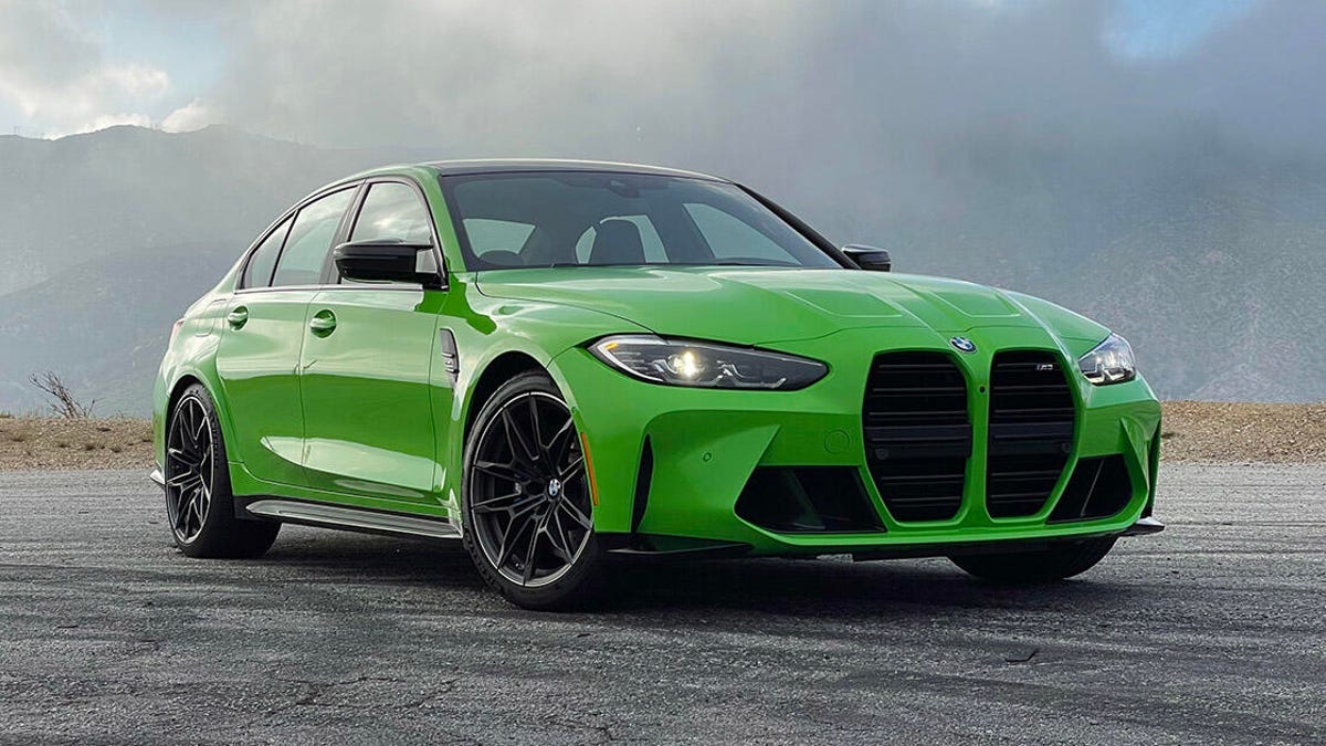
Also BMW. They have ruined lots of otherwise good looking cars with these ridiculous grills.

STM317
PowerDork
8/9/24 3:24 p.m.
Things I dislike about the circled part of the Cadillac CT5:
- Bulky black partition in the middle of the side window
- Rear most section is oddly shaped, and is actually just plastic to look like it completes the greenhouse

David S. Wallens said:
That bugs me, too!! In fact, just recently I was telling someone about that.
I needed to hear this because I have felt uncomfortable every single time I saw the back of these and yet I felt like I was the only one that hated it. 

Trent
UltimaDork
8/9/24 3:40 p.m.
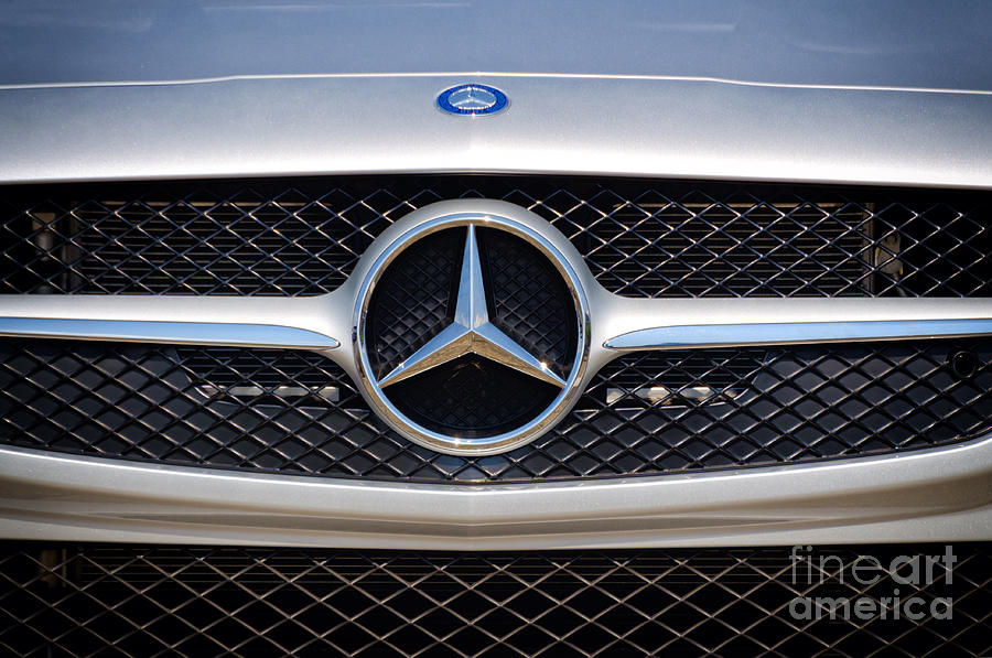
Mercedes putting two and sometimes three emblems within centimeters of each other


Drives me absolutely bonkers. I try not to get annoyed by it on the missus CLK but everytime it catches my eye I cringe
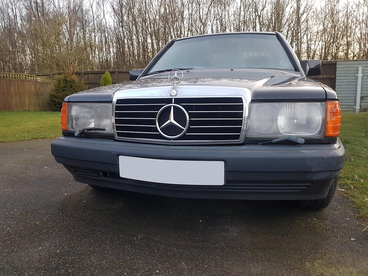
I could also add the whole "1930's chrome tombstone grill on an otherwise modern looking sedan" thing that Mercedes did for decades but they have moved past that it seems.
Trent said:
Mercedes putting two and sometimes three emblems within centimeters of each other


Drives me absolutely bonkers. I try not to get annoyed by it on the missus CLK but everytime it catches my eye I cringe
Yes!! - This is what I'm talking about! An otherwise great car with horrible aesthetics on one thing that kill it for you.
Another one. Color matched headlights on 360s and C6s.


Just do black or dark grey for everything. Not enough contrast imo.


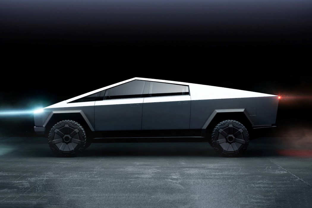
Just the whole thing. I am very petty about basically every single external design decision on this stupid rolling casket.
crankwalk (Forum Supporter) said:
Another one. Color matched headlights on 360s and C6s.


Just do black or dark grey for everything. Not enough contrast imo.

Eventually I have to try and change the lenses on my C6. I've been thinking of painting the buckets black or dark gray.
In reply to wearymicrobe :
I understand the desire to be completely different, and while not at all my taste I think I'd dislike it less if the execution was better. The wavy panels, poor alignment and frequent missing trim bits wouldn't be tolerated on a Versa, they shouldn't be on something costing several times as much.

mtn
MegaDork
8/9/24 4:05 p.m.
In reply to Wally (Forum Supporter) :
I agree. I kind of like the overall design, but every time I see one in person it just looks like a rolling dumpster.
Wally (Forum Supporter) said: Eventually I have to try and change the lenses on my C6. I've been thinking of painting the buckets black or dark gray.
Do it! I think it looks so much better.

The Cadillac ATS-V
One of my favorite cars from the last decade. Totally ruined by the instrument cluster.

It looks like something pulled from a 98 Buick Century.
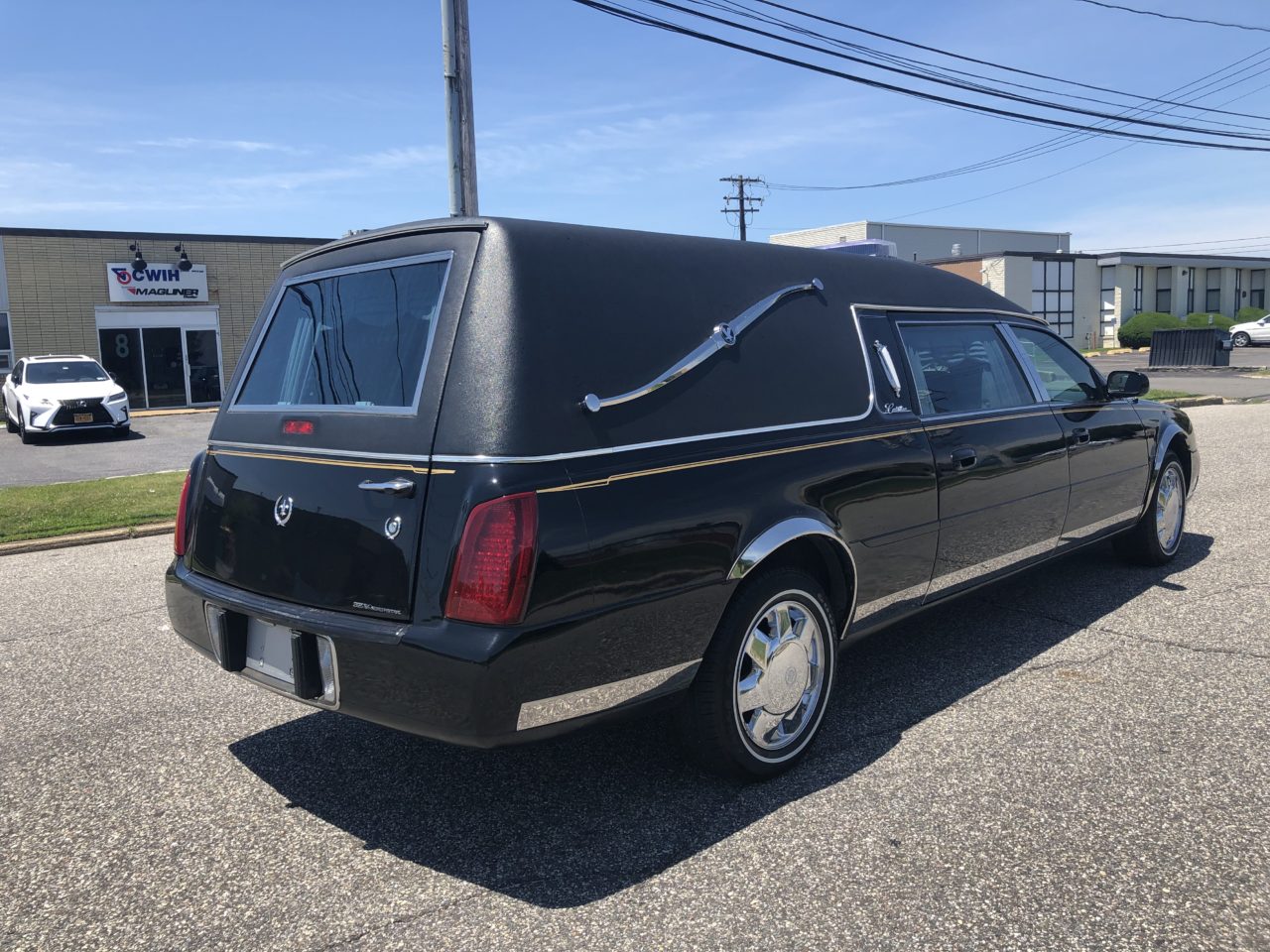
Comment of the floating roof line and Cadillac roof lines reminded me of this one that bothered me recently. Once I saw it, I can not un-see it...
The recent Lexus RX suv, especially in black has a side, third window, chrome strip that looks Hearse-like.


The back of the ND Miata. Pinches in too much. Having flashbacks of a mid 90s Riviera
crankwalk (Forum Supporter) said:
Wally (Forum Supporter) said: Eventually I have to try and change the lenses on my C6. I've been thinking of painting the buckets black or dark gray.
Do it! I think it looks so much better.

I absolutely agree but at least it wasn't chrome.
Ian F (Forum Supporter) said:
My WAG is that is the standard Roundel that was used on all models and it's just barely too large to fit on the vertical section of deck lid. For such a limited production car, sticking two badges on the back ws cheaper than making a single smaller badge.
My WAG is that they wanted people to know damn well what just whupped them, no matter which side they went past on, knowing that most people would never see enough M1s to recognize them on sight.
My design gripe du jour of the day: the temperature selector on my AW11's automatic climate control goes from full cold to 70 degrees. I'm comfortable between 65 and 68 when driving. That leaves me with a choice of too hot or too cold. There is no just right.
Not a visual thing like too many roundels, but a design choice nonetheless.


